


Before: 03: 51
After: 04:18
Before: 03: 51
After: 04:18
Before: 03: 51
After: 04: 18
Buttons with gameplay elements

Comic sequence sample
Buttons with gameplay elements
Comic sequence sample
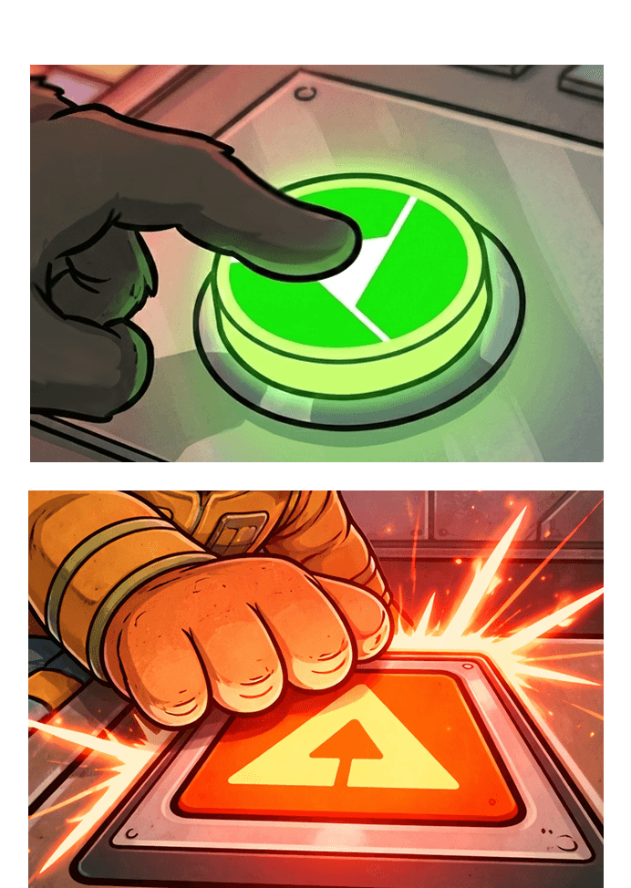
Gameplay elements were subtly woven into the comic sequence to strengthen the connection between the narrative and the game. For example, the spacecraft featured in the game appears on the captain’s hat, while in-game obstacle designs were adapted for the control panel buttons.
Gameplay elements were subtly woven into the comic sequence to strengthen the connection between the narrative and the game. For example, the spacecraft featured in the game appears on the captain’s hat, while in-game obstacle designs were adapted for the control panel buttons.
Website
Website

Primary
Secondary
Neutral

Primary
Secondary
Neutral
Primary
Secondary
Neutral
Primary
Secondary
Neutral
Primary
Secondary
Neutral
Refined Colour Palette
Refined Colour Palette
Problem
The problem at this stage was that the identity needed to pivot to be age appropriate. A strategic visual framework was required to cultivate brand recognition and establish credibility with stakeholders, such as parents and teachers while remaining approachable for students.
Problem
The problem at this stage was that the identity needed to pivot to be age appropriate. A strategic visual framework was required to cultivate brand recognition and establish credibility with stakeholders, such as parents and teachers while remaining approachable for students.
Solutions
Age-Appropriate Visual Identity: Developed a colour palette and visual language informed by colour psychology to balance approachability for students with credibility for parents and teachers.
Consistent Brand Framework: Established and applied unified brand guidelines across digital and print touchpoints to strengthen recognition, trust, and cohesion throughout the user experience.
Research
Research
Accessibility
Accessibility
Brand Identity
Brand Identity
AI Workflow
AI Workflow

A biofeedback training tool was transformed into an immersive, multi-touchpoint brand experience designed to strengthen engagement and credibility.
The scope involved a visual overhaul of the core gaming interface, the development of a strategic brand identity—including a cross-platform colour system and the redesign of an educational workbook that supports users’ biofeedback learning journey.
These improvements harmonised the brand’s digital and tangible touchpoints, delivering a more engaging and unified experience across all customer-facing touchpoints.
Manana Interactive
Manana Interactive
Age-Appropriate UX: Refined gameplay screens, navigation, and menus to better suit the needs, expectations, and abilities of players aged 7–12.
Accessible Data Visualization: Redesigned biofeedback and performance feedback screens to present complex information in a clear, engaging, and easy-to-understand format for younger users.
Age-Appropriate Visual Identity: Developed a colour palette and visual language informed by colour psychology to balance approachability for students with credibility for parents and teachers.
Consistent Brand Framework: Established and applied unified brand guidelines across digital and print touchpoints to strengthen recognition, trust, and cohesion throughout the user experience.
Narrative Onboarding: Developed a cast of mascot characters and a comic sequence to demonstrate emotional regulation tactics.
Interactive Workbook: Redesigned the reflective workbook to match the game’s immersive visual style.
Age-Appropriate UX: Refined gameplay screens, navigation, and menus to better suit the needs, expectations, and abilities of players aged 7–12.
Accessible Data Visualization: Redesigned biofeedback and performance feedback screens to present complex information in a clear, engaging, and easy-to-understand format for younger users.
Age-Appropriate Visual Identity: Developed a colour palette and visual language informed by colour psychology to balance approachability for students with credibility for parents and teachers.
Consistent Brand Framework: Established and applied unified brand guidelines across digital and print touchpoints to strengthen recognition, trust, and cohesion throughout the user experience.
Narrative Onboarding: Developed a cast of mascot characters and a comic sequence to demonstrate emotional regulation tactics.
Interactive Workbook: Redesigned the reflective workbook to match the game’s immersive visual style.

Buttons with gameplay elements
Comic sequence sample
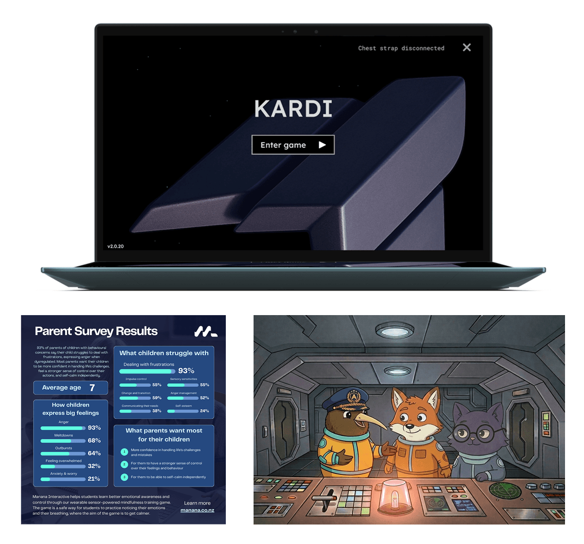
Gameplay elements were subtly woven into the comic sequence to strengthen the connection between the narrative and the game. For example, the spacecraft featured in the game appears on the captain’s hat, while in-game obstacle designs were adapted for the control panel buttons.



Website

Problem
Manana Interactive had entered an exciting area of growth, pivoting from being an adult product to more narrowly targeting students aged 7-12.
The game UX needed to reflect this change in business direction and target age group, ensure that all facets were polished, accessible and appropriate.
Problem
Manana Interactive had entered an exciting area of growth, pivoting from being an adult product to more narrowly targeting students aged 7-12.
The game UX needed to reflect this change in business direction and target age group, ensure that all facets were polished, accessible and appropriate.

Title screen

Device connection screen

Level selection screen

Title screen
Device connection screen
Level selection screen
Title screen
Device connection screen
Level selection screen
Process & Technical Integration
My process began with a heuristic evaluation of the existing UI and research into gamification and intrinsic motivation. I explored how to visualize abstract biofeedback metrics into clear, meaningful feedback for the end users.
Process & Technical Integration
My process began with a heuristic evaluation of the existing UI and research into gamification and intrinsic motivation. I explored how to visualize abstract biofeedback metrics into clear, meaningful feedback for the end users.
Problem
Manana Interactive had entered an exciting area of growth, pivoting from being an adult product to more narrowly targeting students aged 7-12.
The game UX needed to reflect this change in business direction and target age group, ensure that all facets were polished, accessible and appropriate.
Problem
Manana Interactive had entered an exciting area of growth, pivoting from being an adult product to more narrowly targeting students aged 7-12.
The game UX needed to reflect this change in business direction and target age group, ensure that all facets were polished, accessible and appropriate.
Constraints
Maintain thematic consistency with the established space-theme narrative.
Ensure interface usability for children aged 7–12.
Adhere strictly to WCAG 2.2 accessibility standards.
Constraints
Maintain thematic consistency with the established space-theme narrative.
Ensure interface usability for children aged 7–12.
Adhere strictly to WCAG 2.2 accessibility standards.
Solutions
Age-Appropriate UX: Refined gameplay screens, navigation, and menus to better suit the needs, expectations, and abilities of players aged 7–12.
Accessible Data Visualization: Redesigned biofeedback and performance feedback screens to present complex information in a clear, engaging, and easy-to-understand format for younger users.
Constraints
Maintain thematic consistency with the established space-theme narrative.
Ensure interface usability for children aged 7–12.
Adhere strictly to WCAG 2.2 accessibility standards.
Solutions
Age-Appropriate UX: Refined gameplay screens, navigation, and menus to better suit the needs, expectations, and abilities of players aged 7–12.
Accessible Data Visualization: Redesigned biofeedback and performance feedback screens to present complex information in a clear, engaging, and easy-to-understand format for younger users.
Solutions
Age-Appropriate UX: Refined gameplay screens, navigation, and menus to better suit the needs, expectations, and abilities of players aged 7–12.
Accessible Data Visualization: Redesigned biofeedback and performance feedback screens to present complex information in a clear, engaging, and easy-to-understand format for younger users.
Role: UX/UI Design, UX Research
Duration: 6 months







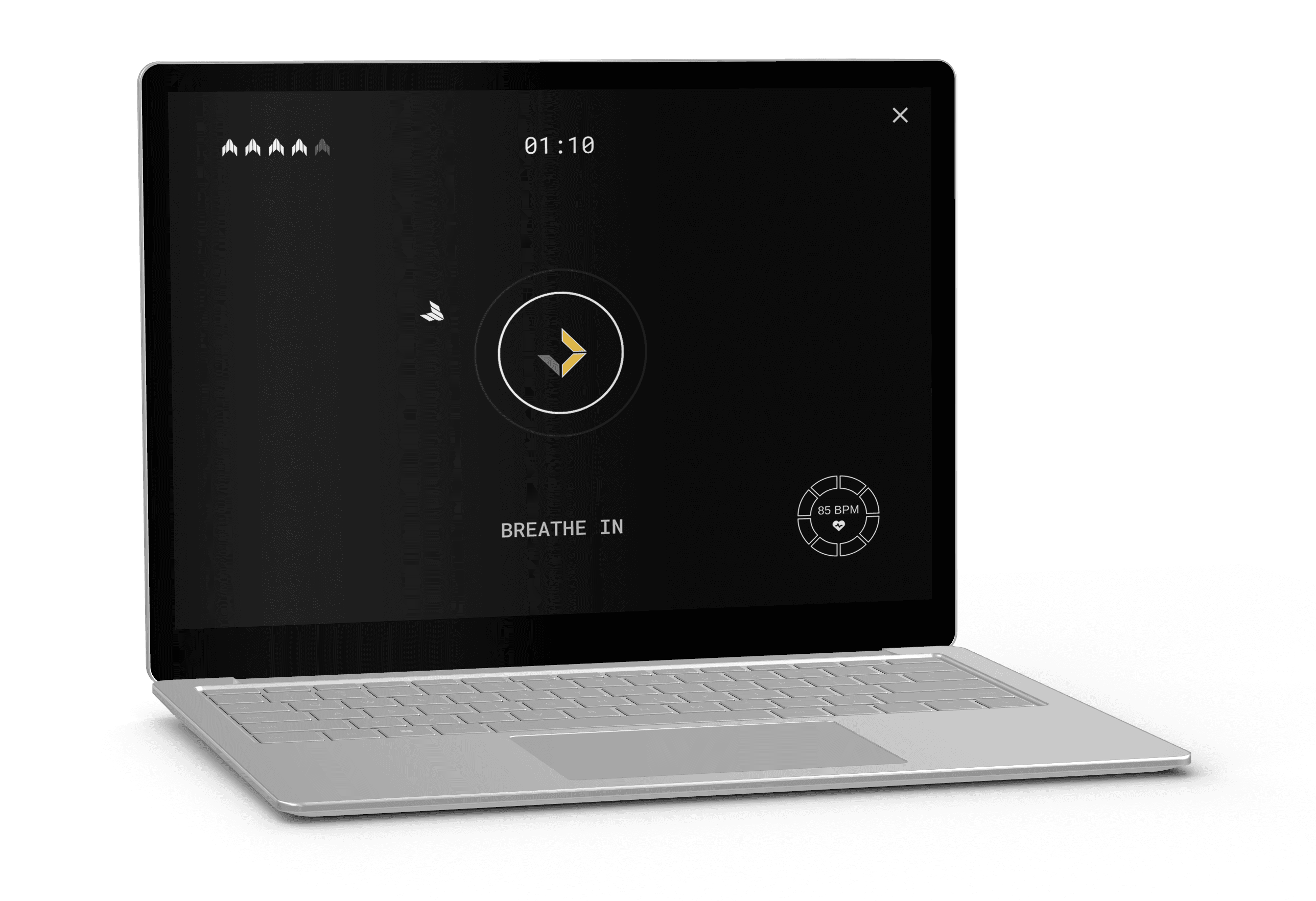
Game UI & Experience
Game UI & Experience
Through iterative wireframing and prototyping, I refined the title and results screens to ensure a cohesive visual language. To streamline the handoff and implementation phase, I upskilled in Unity and GitHub, allowing me to directly facilitate the transition of Figma prototypes into the game engine and ensuring that the final implementation balanced my original vision with technical constraints.
Through iterative wireframing and prototyping, I refined the title and results screens to ensure a cohesive visual language. To streamline the handoff and implementation phase, I upskilled in Unity and GitHub, allowing me to directly facilitate the transition of Figma prototypes into the game engine and ensuring that the final implementation balanced my original vision with technical constraints.
Inclusive Design & Accessibility
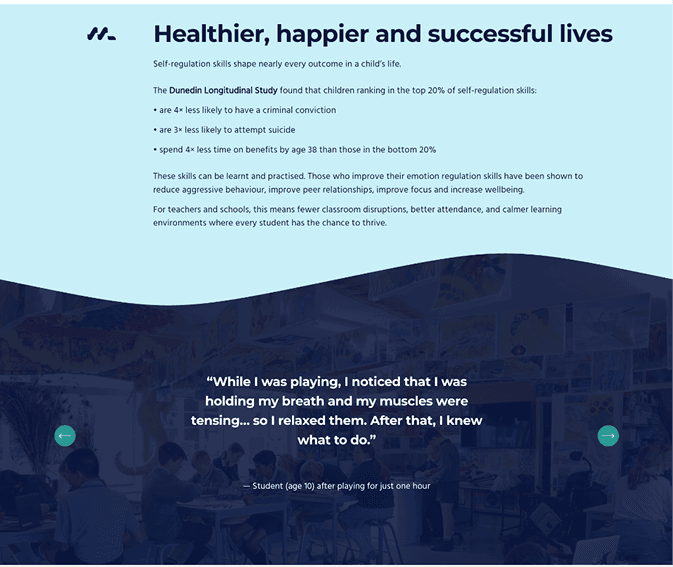
Accessibility was a core consideration throughout the UI design process. I implemented Lexend, a typeface specifically engineered to improve reading proficiency for neurodivergent users—such as those with ADHD or dyslexia—who are highly represented within our target audience. Colour contrast and iconography were evaluated against WCAG 2.2 criteria to ensure an equitable experience for all players.
Inclusive Design & Accessibility
Accessibility was a core consideration throughout the UI design process. I implemented Lexend, a typeface specifically engineered to improve reading proficiency for neurodivergent users—such as those with ADHD or dyslexia—who are highly represented within our target audience. Colour contrast and iconography were evaluated against WCAG 2.2 criteria to ensure an equitable experience for all players.
Inclusive Design & Accessibility
Accessibility was a core consideration throughout the UI design process. I implemented Lexend, a typeface specifically engineered to improve reading proficiency for neurodivergent users—such as those with ADHD or dyslexia—who are highly represented within our target audience. Colour contrast and iconography were evaluated against WCAG 2.2 criteria to ensure an equitable experience for all players.
Brand Identity
Brand Identity
Solutions
Age-Appropriate Visual Identity: Developed a colour palette and visual language informed by colour psychology to balance approachability for students with credibility for parents and teachers.
Consistent Brand Framework: Established and applied unified brand guidelines across digital and print touchpoints to strengthen recognition, trust, and cohesion throughout the user experience.
Problem
The problem at this stage was that the identity needed to pivot to be age appropriate. A strategic visual framework was required to cultivate brand recognition and establish credibility with stakeholders, such as parents and teachers while remaining approachable for students.
Execution
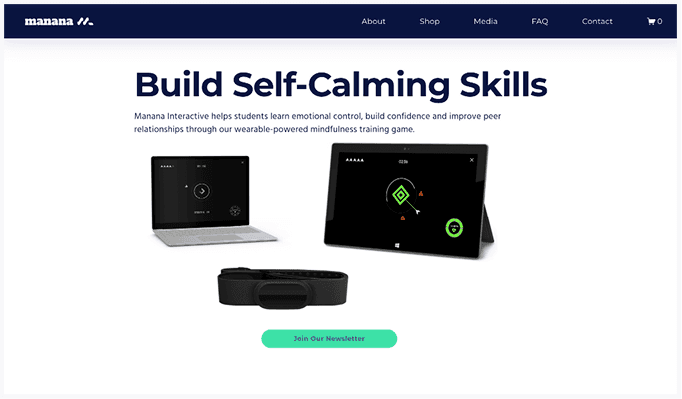
Following an analysis of colour theory, I selected a primary palette of navy and blue to resonate with the 7–12 male demographic. To communicate the product's focus on self-calming, I introduced turquoise and teal as secondary accents, symbolising emotional equilibrium. This balanced aesthetic successfully bridged the gap between a playful student experience and the professional standards expected by key decision-makers.
Execution
Following an analysis of colour theory, I selected a primary palette of navy and blue to resonate with the 7–12 male demographic. To communicate the product's focus on self-calming, I introduced turquoise and teal as secondary accents, symbolising emotional equilibrium. This balanced aesthetic successfully bridged the gap between a playful student experience and the professional standards expected by key decision-makers.
Execution
Following an analysis of colour theory, I selected a primary palette of navy and blue to resonate with the 7–12 male demographic. To communicate the product's focus on self-calming, I introduced turquoise and teal as secondary accents, symbolising emotional equilibrium. This balanced aesthetic successfully bridged the gap between a playful student experience and the professional standards expected by key decision-makers.
Social Media Posts
Social Media Posts
Social Media Posts
Supporting Material
Supporting Material
Problem
To assist with learning outcomes, the product required stronger narrative immersion. Supporting materials needed to introduce the game’s concepts of biofeedback through storytelling and a physical tool for users to track their behavioral progress.
Solutions
Narrative Onboarding: Developed a cast of mascot characters and a comic sequence to demonstrate emotional regulation tactics.
Interactive Workbook: Redesigned the reflective workbook to match the game’s immersive visual style.
Problem
To assist with learning outcomes, the product required stronger narrative immersion. Supporting materials needed to introduce the game’s concepts of biofeedback through storytelling and a physical tool for users to track their behavioral progress.
Solutions
Narrative Onboarding: Developed a cast of mascot characters and a comic sequence to demonstrate emotional regulation tactics.
Interactive Workbook: Redesigned the reflective workbook to match the game’s immersive visual style.
Solutions
Narrative Onboarding: Developed a cast of mascot characters and a comic sequence to demonstrate emotional regulation tactics.
Interactive Workbook: Redesigned the reflective workbook to match the game’s immersive visual style.
Problem
To assist with learning outcomes, the product required stronger narrative immersion. Supporting materials needed to introduce the game’s concepts of biofeedback through storytelling and a physical tool for users to track their behavioral progress.
Characters
Characters
Characters
AI-Assisted Workflow
I utilised an AI-assisted workflow to rapidly iterate on character archetypes and environmental concepts, ensuring they remained age-appropriate and culturally sensitive. By generating base assets through AI and manually refining them, I was able to maintain high production values within tight deadlines.
AI-Assisted Workflow
I utilised an AI-assisted workflow to rapidly iterate on character archetypes and environmental concepts, ensuring they remained age-appropriate and culturally sensitive. By generating base assets through AI and manually refining them, I was able to maintain high production values within tight deadlines.
AI-Assisted Workflow
I utilised an AI-assisted workflow to rapidly iterate on character archetypes and environmental concepts, ensuring they remained age-appropriate and culturally sensitive. By generating base assets through AI and manually refining them, I was able to maintain high production values within tight deadlines.
Interactive Workbook
A design refresh was also undertaken for a reflective workbook that supports users in tracking and reinforcing behavioural progress. Game-inspired visual motifs, typography, and supporting assets such as the comic characters were incorporated throughout the workbook, strengthening brand recognition and maintaining a consistent visual identity.
Interactive Workbook
A design refresh was also undertaken for a reflective workbook that supports users in tracking and reinforcing behavioural progress. Game-inspired visual motifs, typography, and supporting assets such as the comic characters were incorporated throughout the workbook, strengthening brand recognition and maintaining a consistent visual identity.
Interactive Workbook
A design refresh was also undertaken for a reflective workbook that supports users in tracking and reinforcing behavioural progress. Game-inspired visual motifs, typography, and supporting assets such as the comic characters were incorporated throughout the workbook, strengthening brand recognition and maintaining a consistent visual identity.
Outcomes
Outcomes
The redesigned UI and supporting ecosystem have created a more accessible, engaging, and unified experience. By integrating neurodiverse-friendly design, technical implementation in Unity, and a robust brand system, the project now delivers a consistent value proposition across every user touchpoint.
The redesigned UI and supporting ecosystem have created a more accessible, engaging, and unified experience. By integrating neurodiverse-friendly design, technical implementation in Unity, and a robust brand system, the project now delivers a consistent value proposition across every user touchpoint.
Solutions
Age-Appropriate Visual Identity: Developed a colour palette and visual language informed by colour psychology to balance approachability for students with credibility for parents and teachers.
Consistent Brand Framework: Established and applied unified brand guidelines across digital and print touchpoints to strengthen recognition, trust, and cohesion throughout the user experience.
Gameplay
Positive feedback from end users in target age group:
During the pilot, end users in the target age group did not give negative feedback on navigation or UX, instead of giving positive feedback.
Website Engagement
Time spent on homepage:
Website Engagement
Time spent on homepage:
"That was fun!"
"The game helped me calm down."
11.7% increase
Comic engagement materials supported regional, commercial partnership discussions and funding applications for a wider rollout.
Future iterations will focus on the incremental introduction of retention-focused mechanisms, such as digital badges and achievement systems.